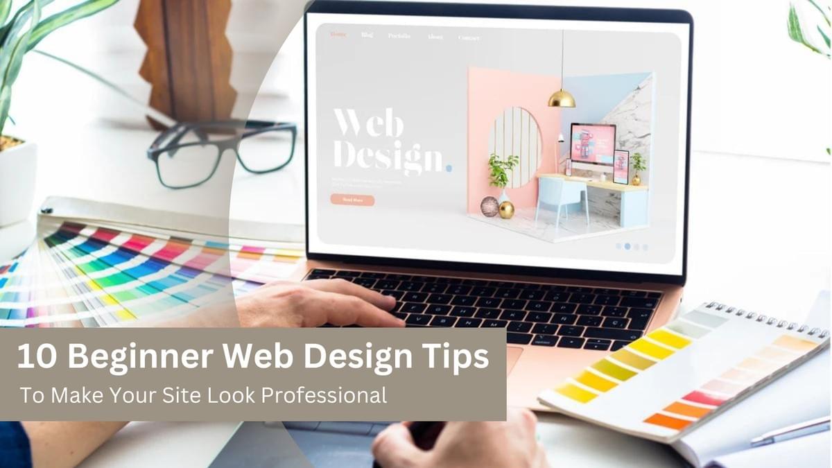
In today’s digital landscape, a website is often the first interaction a potential customer has with your business. A professional, user-friendly site can help establish credibility, improve user experience, and ultimately increase conversions. As a beginner, designing a site that looks polished and functions well can seem daunting. But with the right guidance, you can create a professional-looking website that resonates with your audience.
Here are 10 beginner web design tips to make your site look professional.
1. Choose the Right Color Scheme
The color scheme is one of the first things visitors notice about your site. Your choice of colors should reflect your brand identity and create a visual appeal. A clean, consistent color scheme can give your site a more professional look and feel.
Tips for Choosing Colors:
- Limit your palette to 2–3 primary colors.
- Use complementary colors to create balance and contrast.
- Ensure that your text is easy to read by using high contrast between the background and text colors.
Tools: Use tools like Adobe Color or Coolors to create harmonious color schemes.
Introducing SFWPExperts, specializing in Wordpress website design, and creating professional, user-friendly websites. With a focus on intuitive design, fast loading times, and mobile responsiveness, they help businesses build visually stunning and high-performing WordPress sites that enhance user experience and drive engagement, aligning with modern web design trends.
2. Prioritize Simplicity
One of the most common mistakes beginners make is trying to pack too many elements into a website. Simplicity is key to professional design. A cluttered, chaotic site can overwhelm users and drive them away.
Key Considerations:
- Focus on a clean, minimalist layout.
- Remove unnecessary design elements and information.
- Prioritize functionality over aesthetics to improve the user experience.
Benefits of Simplicity:
- Faster load times.
- Easier navigation.
- Better user engagement.
3. Optimize for Mobile Responsiveness
With a significant percentage of users accessing websites via smartphones and tablets, mobile responsiveness is crucial. A professional website looks good and functions well on all screen sizes.
How to Optimize:
- Use a responsive design framework like Bootstrap.
- Ensure images and content automatically adjust to fit smaller screens.
- Test your website on various devices to ensure consistent performance.
Google also prioritizes mobile-friendly websites in search rankings, so optimizing for mobile can improve your SEO.
4. Use High-Quality Images and Visuals
Low-resolution, pixelated images are an instant giveaway of an amateur website. High-quality, professional visuals can instantly elevate the look of your site and help convey your brand message effectively.
Tips for Using Images:
- Use high-resolution images that don’t pixelate when resized.
- Avoid generic stock photos; opt for custom images if possible.
- Ensure images are optimized for fast loading without sacrificing quality.
For beginners, platforms like Unsplash and Pexels offer free high-quality images you can use for your website.
5. Create Intuitive Navigation
A professional website is easy to navigate. Visitors should be able to find the information they need quickly and efficiently. Clear, logical navigation menus improve user experience and keep users on your site longer.
Best Practices for Navigation:
- Keep your navigation menu simple and accessible from every page.
- Use descriptive labels for menu items so users understand what each link represents.
- Implement a search bar for larger websites to allow users to search for specific content.
User-friendly navigation reduces bounce rates and encourages visitors to explore more of your site.
6. Pay Attention to Typography
Typography is more than just the font style you choose — it’s about how easy your content is to read and how it affects the overall design of your website. Professional websites use typography that aligns with the brand and enhances the reading experience.
Tips for Professional Typography:
- Choose no more than two to three fonts to maintain consistency.
- Ensure the font size is large enough for readability (typically 16px or larger).
- Use web-safe fonts that are compatible across all devices.
Make sure your headers and body text have clear font hierarchies, making it easier for users to scan and read your content.
Read More Articles:
- WordPress Website Design Guide: Things To Know Before Creating WordPress Websites
- What is Guerrilla Marketing? Top effective examples and tactics
- The Impact of AI On Social Media Marketing
- 10 Essential On-Page SEO Factors You Need to Know
- 5 Reasons To Refresh Content: Boost Your SEO, Engagement, and Conversions
- ChatGPT Prompts for SEO: Boosting Your SEO Strategy with AI
Visit Site: Wordpress development company
Reference Profile Websites: